Zeit
A time traveling responsive e-commerce website
Project Overview
Challenge
Zeit is a fictional platform that allows users to travel back in time to 289 destinations. Locations are resort styled. Zeit has contracted me to rebrand their logo and e-commerce website to make it responsive across desktop, tablet and mobile.
Objectives
Design a logo that is historical and modern
Design a responsive website that allow users to search and filter that fits their preference
Duration
4 weeks (160 hrs)
Team
Self with feedback from mentor & peer
Tools
Sketch, Invision, Illustrator
Role
UX Designer (Research, Visual Design, Interaction Design, User Testing)
Design process
Empathize
Research Plan
Market Research
Competitor Research
User Research
Empathy map
Persona
Define
Project Goals
Card Sorting
Site Map
Ideate
Feature Roadmap
Task Flow
User Flow
UI Requirements
Branding
Wireframes
Responsive UI Design
UI Kit
Prototype
Sketch
Invision
Test
Usability testing
Affinity Map
Priority Revisions
Empathize
I began by researching to gain a better understanding of Zeit users
Research Plan
I created an outline of criteria for how the research will be conducted. I created this research plan to ensure that the results yield the best possible solution for the client. View the document here
Secondary Research
Market Research
I then researched current traveling companies and statistics to gain a better understanding of trends, successes, users, and patterns to be able to apply them to Zeit
Competitor Research
After I researched the market, I dove into competitor research. I compared and contrasted companies that have similar traveling aspects. I identified three Direct & two Indirect competitors to gain an understanding of current patterns, successes, and weaknesses.
Below is a chart for comparison.
Provisional Persona
After I validated my research goals/ assumptions through my secondary research for Zeit. I created three provisional personas that potentially represent the Zeit user.
Primary Research
User Research
I then conducted User interviews with prospective users to gain deeper insight into user needs, goals, needs, motivations, & frustrations. With limitations due to the pandemic and time constraints; interviews were conducted mainly through phone calls consisting of 12 questions that were open-ended.
Read the script in full detail here.
Summary of User Interview
# of participants: 7
Length of interviews: 10-15 minutes
5 females / 2 males.
Ages: 20 - 57
Assumptions Validated
• User believes time traveling is only for the wealthy
Inconclusive: Participants did not address, however, 7/7 participants want to get a deal for their travels
• User believes time traveling can be dangerous
Validated: 7/7 participants say that safety is a concern for them, especially when they are required to travel for work and they have to walk around.
• User needs to be able to speak the language
Inconclusive: Participants say that it would be nice to know the language when traveling
• User wants to be able to share the experience
Validated: 7/7 participants all use their phones to share their experience
• User will want payment options or financing options
Validated: 7/7 participants all stated that they use some form of a credit to pay for their trip
Research Synthesis
Empathy Map
To understand user’s needs, goals, frustrations, and motivations. I created an empathy map where I transcribed all sentences that users stated onto individual post-its. After I transcribed all statements, I organized and grouped the statements based on similarity to uncover user’s insights and needs.
Findings
Insights
• 5/7 Most travelers preferred that they can rent a car to explore on their own
• 5/7 Most travelers preferred to have some form of itinerary preset
• 7/7 Most travelers looked through third-party sellers for deals
• 6/7 Most travelers preferred that their accommodation is walkable
Needs
• Travelers need to be able to rent a car to drive explore on their own
• Most travelers need to plan out their day to day schedule
• Most travelers need a way to not pay full price.
• Most travelers need to be near local attractions
User persona
After I synthesized my research, I created a realistic and fictional persona that best represents my findings. Meet Juniper, she is young, and she loves to travel for personal and work.
Define
Made sense of the data that was gathered through research based on customer’s needs and insight.
Project Goals
The Venn diagram below helped re-access the project goals to visually compare business goals and user goals to outline how the site should look. I did this to see how the two goals can be aligned and prioritized.
Card Sorting
I gained an understanding of how the site should be organized, by conducting a card sorting exercise.
Summary of a card sorting exercise:
# of participants: 5
Estimated length: 10-15mins
The average time took: 9 mins
3 females | 2 males
Ages: 29-40
Site Map
With the gathered information from the competitor’s analysis, project goals, road map, and card sorting I created a Zeit Site Map that shows the site’s interconnectivity. I created this so that I could understand and organize how the site would function.
Ideate
To achieve the best possible solution by brainstorming all possible solutions.
Feature Roadmap
I prioritized and categorized features for Zeit by creating a feature that took into consideration: business, technical, and user goals. I categorized based on: must-have, nice to have, surprising/delightful, and can come later. These features are prioritized based on capability, cost, and time.
Task Flow
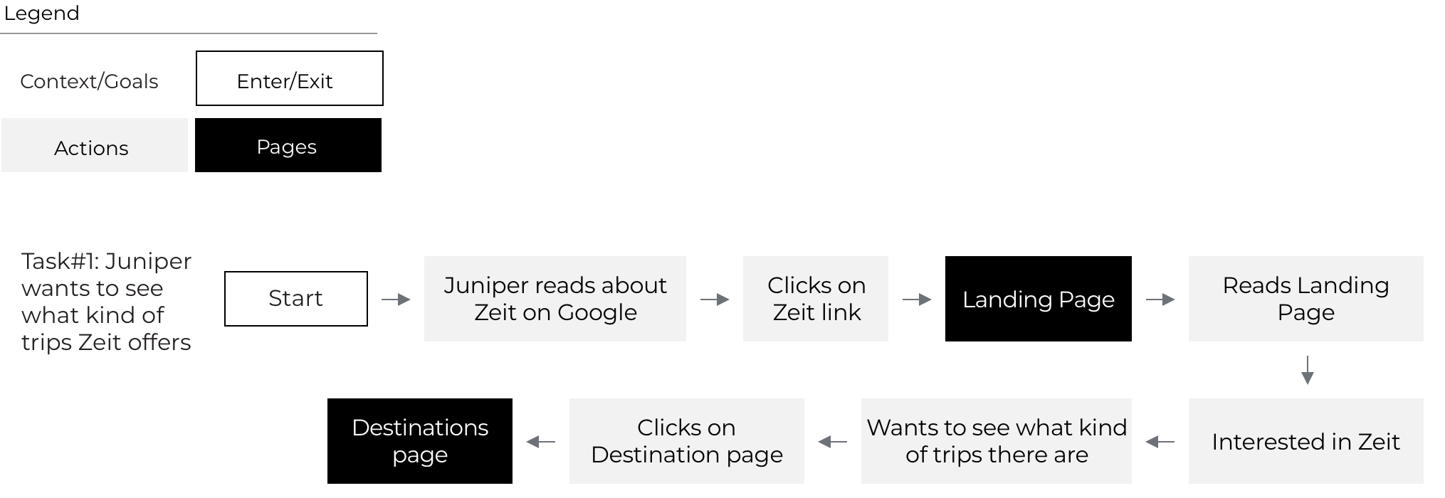
I defined potential tasks Users may take when interacting with Zeit. I created a flow diagram to understand a path that a user could take to complete the task.
The three hypothetical and potential tasks are:
Task #1: Juniper wants to see what kind of trips Zeit offers
Task #2: Juniper wants to see what deals Zeit offers
Task #3: Juniper wants to add a trip to her cart
View the Task flow in more detail below!
User Flow
To better understand the User’s interaction with the site. I created a User Flow diagram to gain insight into potential navigational patterns of Users. I showed this by illustrating decision trees. I created two scenarios for Juniper in which I hypothesized her actions and decisions to get to certain pages on Zeit’s site.
The two scenarios that I created for Juniper are:
Scenario #1: Juniper wants to take a trip but she doesn’t know where she wants to go. She’s looking for a good deal.
Scenario #2: Juniper sees her favorite musician pop up as a new travel destination for Zeit on social media
View the User flow in more detail below!
UI Requirements
After I explored and brainstormed potential task/user flows I created a page of UI requirements for Zeit.
This will orchestrate what needs to be designed for Zeit and will help keep information organized.
Wireframes
Sketches
After I created the UI requirements document, I started sketching into the landing page for Zeit. This is so that I can generate as many ideas as possible to create the best solution for the User pulling from competitor sites, and persona needs, goals, frustrations, and motivations.
Lo-fi responsive wireframes
After I generated as many sketches as possible, I started digitizing the low-fidelity responsive wireframes. I did this for the landing page and destinations page to visually realize what Zeit can look like as well as to for-see any possible problems that can occur on multiple devices: Desktop, Tablet, and Mobile.
Branding
Before I sketched into the logo, I started thinking about the brand’s attributes:
Modern
Minimal
Elegant
Timeless
Wealth
I then created a Pinterest board for Zeit to gather inspiration for: Mood, Logo, Typography, Color, and Layout.
Check it out here!
Sketches
Focused on the brand’s attributes, I brainstormed how the Zeit logo could best represent the brand. I hand sketched, iterated, and vectorized into different scales. I went through a few iterations with opinions from the mentor’s guidance.
Style Tile
After I created the logo, I compiled this document for Zeit to synthesize the research and inspiration for the logo, color, typography, and imagery. This acted as a guide when I create hi-fi responsive wireframes to maintain cohesiveness.
Responsive UI Design
I used the style tile and the lo-fi responsive wireframes to create the landing page and destinations page UI to review and check for the overall cohesiveness in the visual and information hierarchy.
UI Kit
After I created the pages for the high-fidelity responsive wireframes. I compiled a file that stores all UI elements. This UI kit is only a draft version, this will get reworked as the site gets maintained and updated.
See extended version here
Below is the shortened version:
Prototype
I then moved into creating a high fidelity representation of prototype to be able to test for ideas and solutions.
In this phase, I created a prototype using Invision. This prototype is a simplified version consisting of the landing page, destinations page, deals page, trip page, and the first check-out page. I used this prototype to conduct a usability test and asked participants to complete the following tasks:
Task #1: Identify a time travel trip back to: “ 1969 Woodstock Music & Art Fair | Jimi Hendrix ”
Task #2: Get to the first check out page of the book trip for “1969 Woodstock Music & Art Fair | Jimi Hendrix”
Additional, if time permits:
Task#3: Identify what special offers Zeit has to offer
Check out the link below to the prototype below!
Test
I then conducted testing to gain insight into user feedback to help prioritize revisions to help implement any changes for bettering the site
Usability test
Usability test plan
Created a plan to help guide in the process of prototype testing with a focus on the following:
• Test goals
• Test subjects
• Methodologies
• Participants/ Recruiting plan
• Test completion rate
• Error-free rate
Read the script in full detail here.
Summary of User Interview
# of participants: 6
Length of interviews: 10-15 minutes
5 females / 1 males.
Ages: 20 - 40
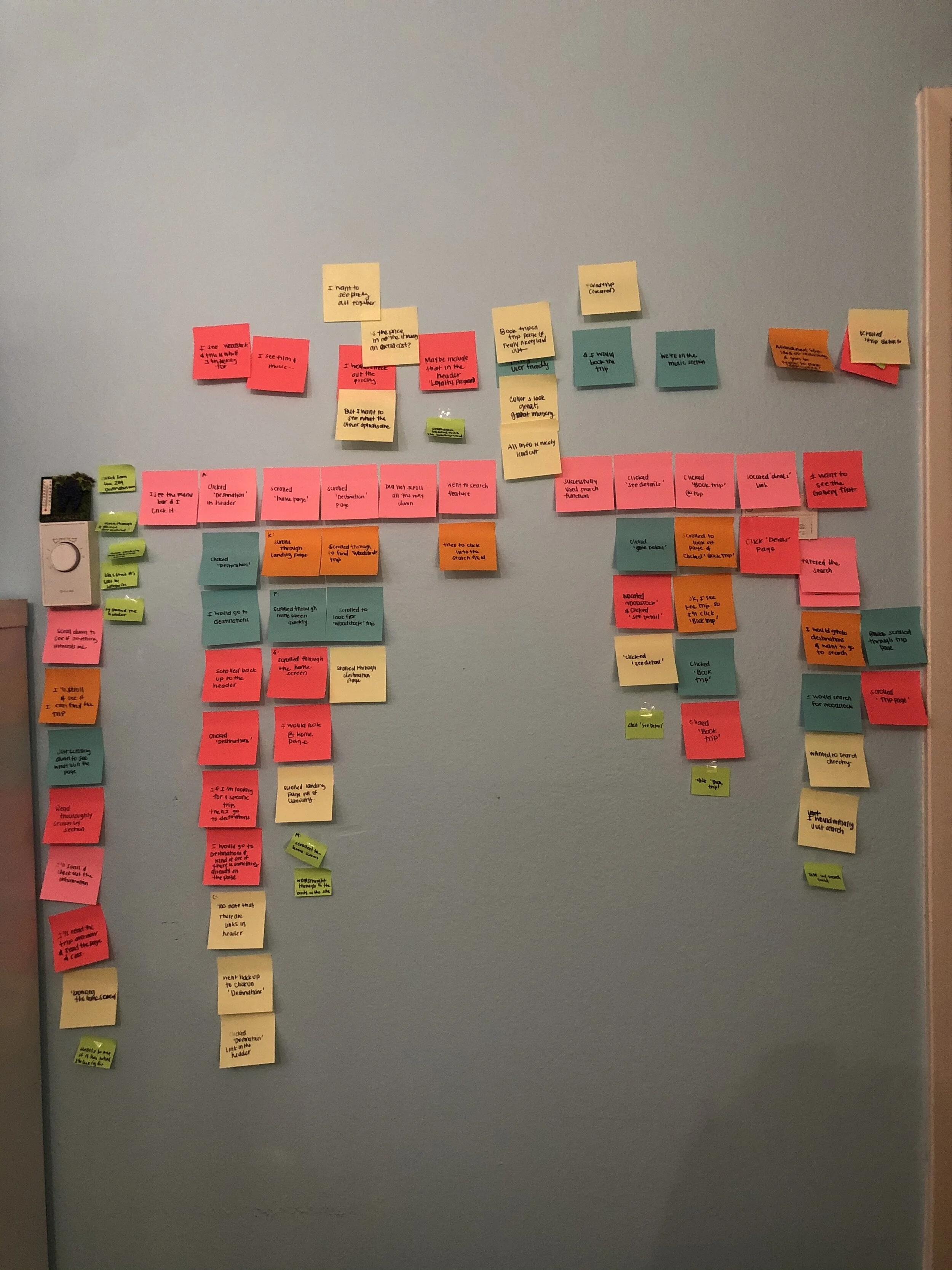
Affinity map
Observed and recorded findings through transcribing testing in detail, documented slips, and time of completion.
Insights:
• Users preferred to directly search when they know what they are looking for
• Users were confused with the categorization of the drop-down menu
Recommendation:
• Add in a direct search feature (High Priority)
• Recategorize drop-down categories (Low Priority)
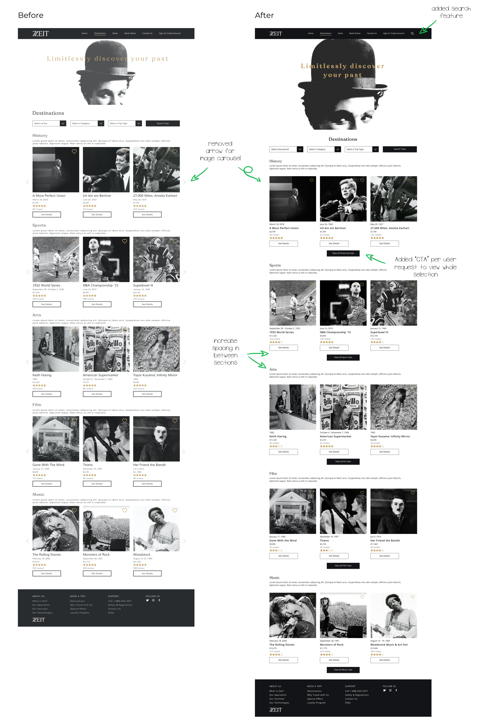
Priority revisions
Reiterated prototype based on the majority of User feedback and findings from Affinity map.
I added in a search feature and I reworded some categories. I also cleaned up the site as far as text hierarchy, spacing, alignment, remove unnecessary elements, and sizing of overall elements to be more cohesive.
Final thoughts + Next steps
Final thoughts
This is my first UX design project. There were frustrations along the way as I was trying to grasp the terminology and the process of UX design. I found this project challenging in the research phase. It’s fictional in character but was still applicable in the process. I had fun finding a way to communicate to my users how it’s relatable travel as well as manufacturing the visual aspect to make it relevant in our present time. I gain valuable insight into how to achieve and complete each process of design.
Next steps
Using the revised prototype, I would re-test the priority revision recommendations. Finalize as much of the UI kit as possible (this would get updated as the product gets developed), and finalize any design specs using InVision Inspect to be able to hand off to developers. I will be available for any further questions.


