Kai
An end to end application
Project Overview
Challenge
Kai is a start-up nonprofit donation company. Its mission is to be able to help the community. Kai wants to scale their business to better improve the connection between their donors to the shelters that serve people in need. They have a few refrigerated trucks that help transport fresh food. They need to better automate communication with their donors and help their drivers manage their routes.
Objectives
Design a logo that is compassionate and modern
Design an end to end application
Increase user engagement & Encourage regular donation
Duration
4 weeks (80 hrs)
Team
Self with feedback from Mentor, & Peers
Tools
Sketch, Invision, Illustrator
Role
UX Designer (Research, Visual Design, Interaction Design, User Testing)
Design process
Research
Market Research
Competitive Analysis
Provisional Persona
User Interview
Empathy Map
User Persona
Strategy
HMW Questions
Product Goals
Product Roadmap
Application Map
Design
Task Flow
User Flow
Wireframes
Branding
Responsive UI
UI Kit
Prototype & Test
Mid-Fidelity Prototype
Usability Testing
Affinity Map
High-Fidelity Prototype
Empathize
Research! Research! Research!
I began by conducting research to gain a better understanding of Kai users
Research Plan
I created an outline of criteria for how the research will be conducted. I created this research plan to ensure that the results yield the best possible solution for the client.
Below is a chart that outlines my goals, questions, assumptions, methodologies, and participants.
Secondary Research
Market Research
The first part of my research is conducted by looking into the current market. To see where there are successes, failures, trends, and customers that could be incorporated into Kai. I dived into articles, blogs, and known companies that conduct research/surveys for this specific market annually.
Competitor Research
After I researched the market, I looked into direct and indirect competitor companies to Kai. I did this so that I can gain an understanding of current patterns, successes, and weaknesses.
Key points:
Overall Strength: Major connections with distributors
Overall Weakness: Low application engagement
Below is a chart for comparison
Provisional Persona
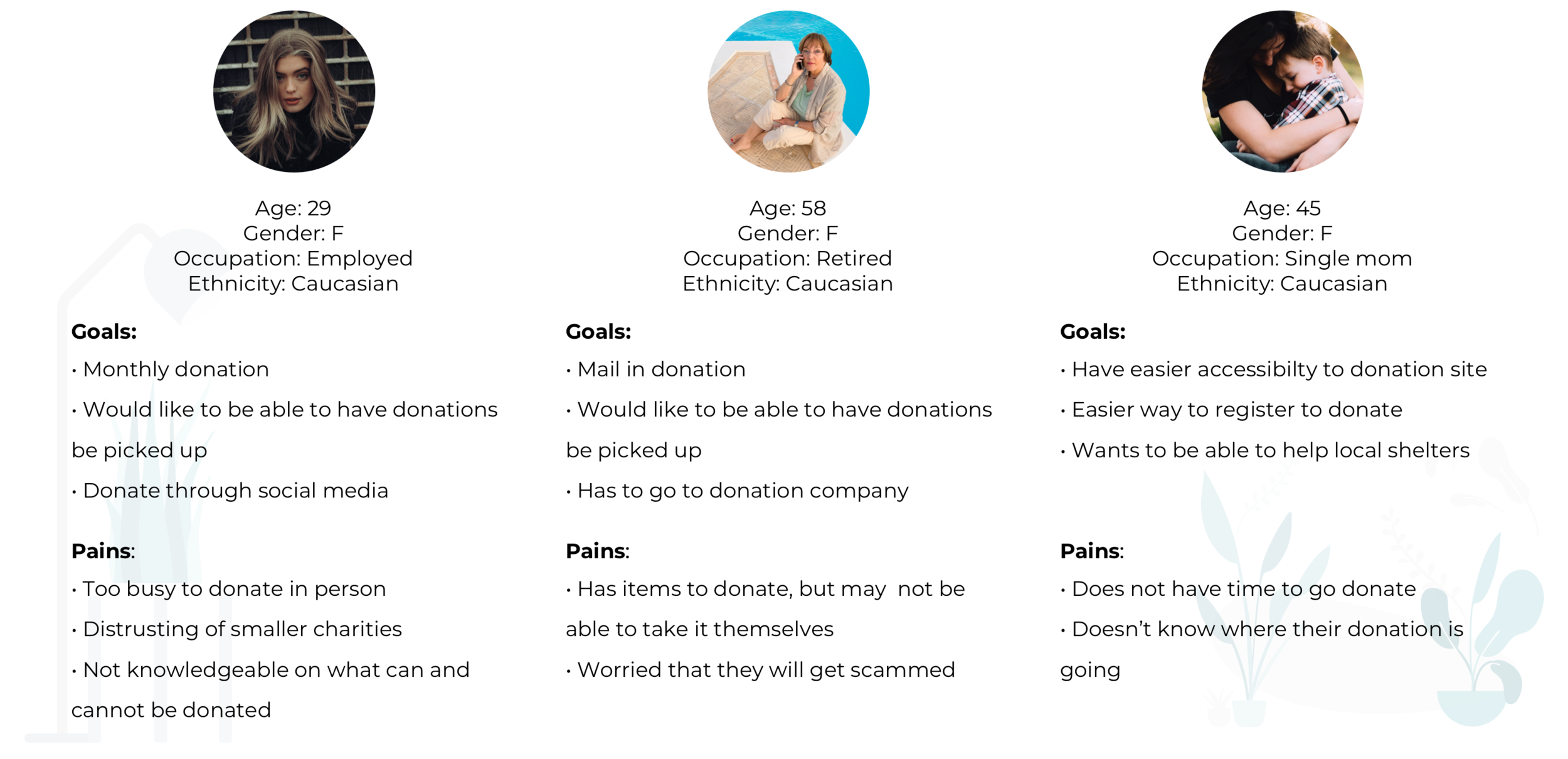
After I validated my research goals/ assumptions through my secondary research for Kai. I created three provisional personas that potentially represent the Kai user.
Primary Research
User Interview
I then conducted User interviews with prospective users to gain deeper insight into user needs, goals, needs, motivations, & frustrations. With limitations due to the pandemic and time constraints; interviews were conducted mainly through phone calls consisting of 10 questions that were open-ended.
Read the script in full detail here.
Summary of User Interview:
# of participants: 4
Length of interviews: 10-15 minutes
2 females / 2 males.
Ages: 30 - 40
Assumptions Validated
• Users thought that donating food can be complicated
Validated: 4/4 of participants verbalized that there are complications with their donation because the shelter’s information did not clearly state what they accept in a donation.
• Users didn’t know where to donate
Inconclusive: All participants were from different areas of the world and do not use the same method of discovering shelters and charities.
• Users donated what they don’t use
Validated: 4/4 of participants stated that they donate items that they don’t use anymore.
• Users liked to donate money more than food
Validated: 4/4 participants all stated that they have donated in the forms of monetary donations
• Users felt that donating will take too much time
Validated: 3/4 participants stated that it takes them 1 day+ to organize, and take the initiative to go drop off the donations.
Research Synthesis
Empathy Map
To understand user’s needs, goals, frustrations, and motivations. I created an empathy map where I transcribed all sentences that users stated onto individual post-its. After I transcribed all statements, I organized and grouped the statements based on similarity to uncover user’s insights and needs.
Findings
Insights
• 4/4 - Users don’t have time to drop off their donations
• 4/4 - Users want to know how their donation helped people
• 3/4 - Users have to plan ahead of time for donating
Needs
• Users need to have someone pick up their donations
• Users need to receive feedback on their donation
• Users need to be told what they can donate
User persona
To represent a potential user of Kai, I created a realistic and fictional persona that best represents the findings/research. Meet Lily, she represents the ‘Giver.’
I created the user persona so that I can reference back to as I am designing, and to justify the direction of the design.
Strategy
After I researched, synthesized my research to empathize with my user. I start to define and Ideate the information obtained. I strategized how to execute the product.
POV Statements & HMW Questions
Based on my insight/needs, I created 3 ‘How Might We’ questions. I created the point of view statements from Lily’s perspective to be able to define and understand the user’s perspective. I did this so that I am able to formulate the ‘How might we?’ questions to help brainstorm ideas to help foresee any solutions to frustrations.
Brainstorming HMW solutions
I brainstormed each HMW question twice at 2 minutes each to draw about as many solutions as possible. Focused on the number of solutions instead of perfection, I did this so that I can come up with as many creative solutions as possible. This is essential in the defined stage because this is where I can generate ideas.
Product Goals
The Venn diagram below helped re-access the project goals to visually compare business goals and user goals to outline how the site should look. I did this to see how the two goals can be aligned and prioritized.
Product Roadmap
I prioritized and categorized features for Kai by creating features that took into consideration: business, technical, and user goals. I categorized based on: must-have, nice to have, surprising/delightful, and can come later. These features are prioritized based on capability, cost, and time.
Check out the airtable below:
Application Map
With the gathered information from the competitor’s analysis, project goals, road map; I created Kai’s application map that shows the app’s interconnectivity. I created this so that I could understand and organize how the site would function.
Design
Task Flow
I defined potential tasks Users may take when interacting with Kai. I created a flow diagram to understand a path that a user could take to complete the task.
The three hypothetical and potential tasks are:
Task #1: Lily wants to sign up for an account to donate
Task #2: Lily wants to search for a charity
Task #3: Lily wants to schedule a donation pick up
View the Task flow in more detail below!
User Flow
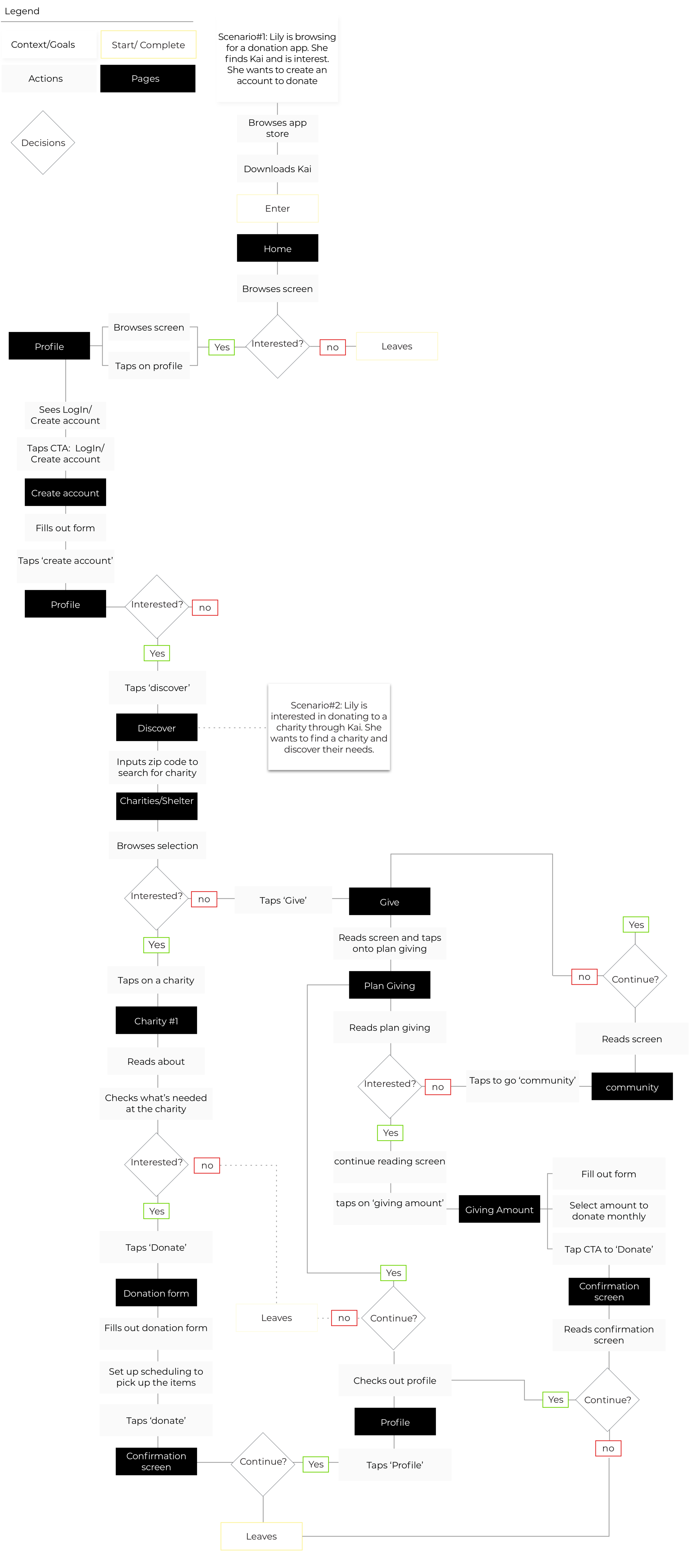
To better understand the User’s interaction with the application. I created a User Flow to gain insight into potential navigational patterns of Users by illustrating decision trees. I created two scenarios for Lily in which I hypothesized her actions and decisions to get to certain screens on Kai’s app.
The two scenarios that I created for Lily are:
Scenario#1: Lily is browsing for a donation app. She finds Kai and is interest. She wants to create an account to donate
Scenario#2: Lily is interested in donating to a charity through Kai. She wants to find a charity and discover their needs.
View the User flow in more detail below!
UI Requirements
A document that outlined the User Interface for users to complete their tasks, this document will get updated throughout the design process. I created the pages based on my task flow, user flow, the scenarios are based on my user’s point of view.
This will orchestrate what needs to be designed for Kai and will help keep information organized.
Wireframes
Sketches
After I created the UI requirements document, I started sketching into each screen for Kai. I did this so that I can generate as many ideas as possible to create the best solution for the User pulling from competitor sites, and personal needs, goals, frustrations, and motivations.
Mid-fidelity wireframes
After I generated as many sketches that I can, I started digitizing Mid-Fi wireframes for each main screen, as well as subscreens that helped users seamlessly interact with the application and complete tasks.
I used these wireframes for prototyping and conducting usability testing.
Mid Fidelity Prototype
After I rendered the mid-fidelity wireframes, I created a prototype using Invision. This mid-fidelity prototype is a simplified version consisting of home, search, give community screens. As well as screens to complete schedule pick-up donation. I used this prototype to conduct a usability test and I will ask participants to complete the following tasks:
Task #1: Lily wants to sign up for an account to donate
Task #2: Lily wants to search for a charity
Task #3: Lily wants to schedule a donation pick up
Check out the link below to the prototype below!
Prototype & Test
Usability testing
Usability test plan
Created a plan to help guide in the process of the testing prototype with a focus on the following:
• Test goals: What I would uncover while performing the test
• Test subjects: What will be tested
• Methodologies: Method of testing
• Participants/ Recruiting plan: Who will be participating
• Test completion rate: Expectation is 100% completion rate for all participants
• Error-free rate: Expectation is 90% error-free rate because the prototype has limited capabilities. This will be calculated with a 1 point to 1 error ratio. Where I will take the 100% completion rate and subtract any 1 error. I will note all mistakes and slips.
Read the script in full detail here.
Conducting Usability testing
I booked time with each participant and carried out the testing in 1 day. I carried out the testing using Invision/ Zoom and asked each participant to share their screens with me. I asked them to think out loud and shared their thoughts as they performed each task. I recorded their screen and jotted down notes.
Summary of User Interview
# of participants: 5
Length of interviews: 10-15 minutes
5 females
Ages: 20s - 30s
Affinity map
Observed and recorded findings through transcribing testing in detail, documented slips, and time of completion. I created an affinity map based on my research findings, I noted down everything that was said by each participant during the usability test on to post-it notes. I created clusters out of any common frustrations or actions. I did this to synthesize information that I gathered from conducting the Kai prototype test to uncover any issues so that I can increase usability for the users.
Mid-fidelity Priority revisions
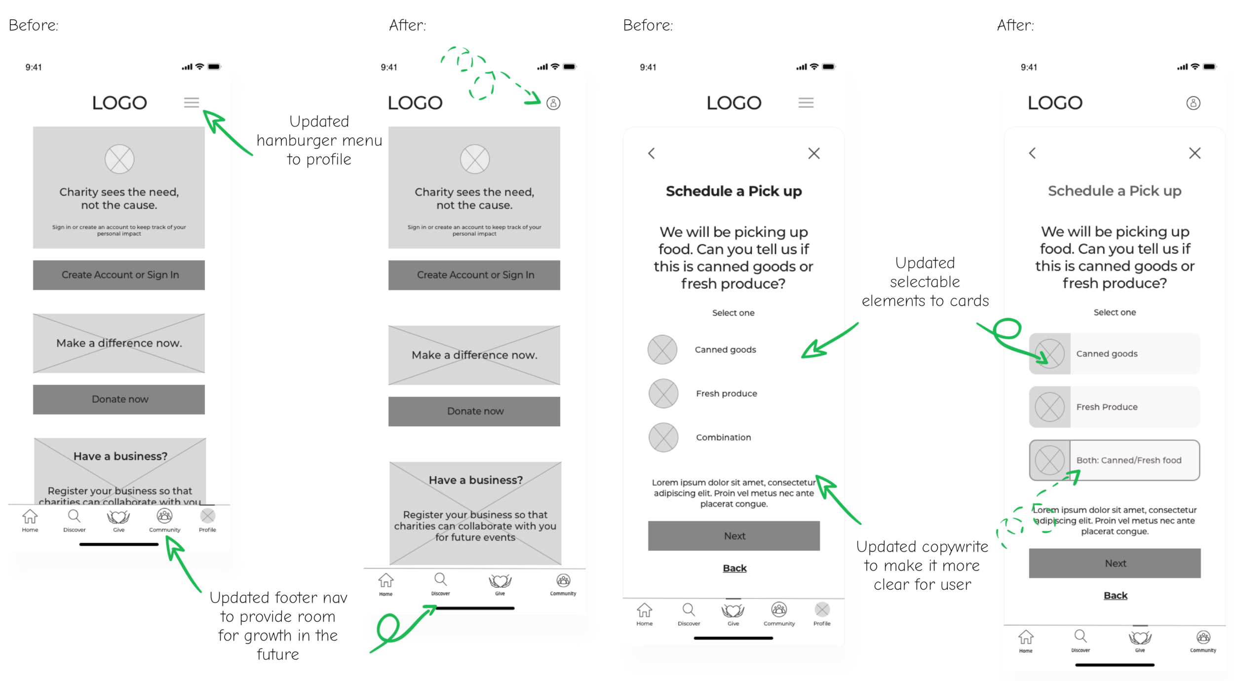
After I synthesized the information and learned about the user’s frustrations while interacting with my prototype. I revised the prototype using my priority chart. I did this so that I can further test my revisions to better my understanding of usability for my users before adding in any colors, images that may distract users from full engagement with the information architecture.
Main revisions based on the priority level I set up for each recommendation:
Change the hamburger menu to profile icon
Rework home screen terminology of ‘Discover’
Have introduction screens that will quickly onboard users
Change wording: combination to ‘Both: Canned and Fresh food’
Change each selection of scheduled pick up to cards
Branding
Before I sketched into the logo, I started thinking about the brand’s attributes:
Trustworthy, Sincerity, Compassion, Warmth, Modern
I then created a Pinterest board for Kai to gather inspiration for: Logo, Typography, Color
Check it out here!
Sketches
Focused on the brand’s attributes, I brainstormed how the Kai logo could be designed to fit the brand’s attributes. I started by hand sketching out my ideas. I reiterated and vectorized it into different scales. I went through a few iterations with opinions from my mentor’s guidance.
Style Tile
In unison with creating the logo, I created the style tile for Kai to synthesize the research and inspiration for the logo, color, typography, and imagery. This acted as a guide when creating hi-fi responsive wireframes to maintain cohesiveness.
UI Kit
After I created the style tile, I created a compiled file that stores all UI elements. This UI kit is only a draft version, this will get reworked as the site gets maintained and updated. I created this file to be able to communicate with developers, stakeholders, project managers, and business owners.
High - Fidelity Wireframes & Prototype
I used the style tile and the mid-fi responsive wireframes to create the high fidelity wireframe & prototype.
I referenced the style tile and UI Kit to maintain consistency in visual hierarchy
High Fidelity Prototype
After I conducted my usability testing on the mid-fidelity wireframes, I created a high-fidelity prototype to further test for usability. I did this so that I can further dive into any insights to better Kai before launch.
Final thoughts + Next steps
Final thoughts
I was so worried when I first started this project because it’s a B2B concept where the goal is to build an end-to-end application. This project has taught me to focus on research, and how to onboard users. My favorite part of this project is the research. A great passion of mine is being able to give back and learning of ways I can empathize and help other humans out there. There are so many people out there that need help and if this can help even in the slightest way, I’m happy.
However, I also enjoyed the brand designing portion of this project. I got to utilize my background in design and build out the foundation for the aesthetic of the app.
Next steps
Using the revised prototype, I would re-test the priority revision recommendations. Finalize as much of the UI kit as possible (this would get updated as the product gets developed), and finalize any design specs using InVision Inspect to be able to hand off to developers. I will be available for any further questions.


