Pacific Pet Grooming
A full service online booking for pet grooming
Project Overview
Challenge
Pacific Pet Grooming is a local pet groomer that just opened within the past three months. They are family-owned and operated. They have a yelp account but that's the extent of their online marketing. They are located on a busy street and get most of their business through yelp and foot traffic. Pacific Pet Grooming is the only cage-free groomer within the area.
Objectives
Redesign a logo that is trustworthy and fun
Design a responsive website that allows users to book an appointment online
Duration
4 weeks (160 hrs)
Team
Self with feedback from mentor, peers, and business owner
Tools
Sketch, Invision, Illustrator
Role
UX Designer (Research, Visual Design, Interaction Design, User Testing)
Design process
Empathize
Research Plan
Market Research
Competitor Research
User Research
Empathy map
Persona
Define
POV & HMW
Brainstorming HMW
Business/User Goals
Site Map
Ideate
Feature Roadmap
UI Requirements
Task Flow
User Flow
Low Fidelity Wireframes
Mid Fidelity Wireframes
Branding
Responsive UI Design
UI Kit
Prototype
Sketch
Invision
Test
Usability testing
Affinity Map
Priority Revisions
High Fidelity Wireframes
Prototype (Hi-Fi)
Empathize
I begin by conducting research to gain a better understanding of Pacific Pet Grooming users
Research Plan
I created an outline of criteria for how the research will be conducted. I created this research plan to ensure that the results yield the best possible solution for the client.
Secondary Research
Market Research
I then researched current traveling companies and statistics to gain a better understanding of trends, successes, users, and patterns to be able to apply them to Pacific Pet Grooming
Competitor Research
After I researched the market, I dove into competitor research. I compared and contrasted companies that have similar grooming aspects. I identified three Direct & two Indirect competitors to gain an understanding of current patterns, successes, and weaknesses.
Below is a chart for comparison.
Primary Research
User Research
I then conducted User interviews with prospective users to gain deeper insight into user needs, goals, needs, motivations, & frustrations. With limitations due to the pandemic and time constraints; interviews were conducted mainly through phone calls consisting of 12 questions that were open-ended.
Read the script in full detail here.
Summary of User Interview
# of participants: 5
Length of interviews: 10-15 minutes
3 females / 2 males.
Ages: 21 - 45
Assumptions Validated
• User believed that pet grooming is expensive
Validated: 5/7 participants believed that pet grooming is expensive
• User believed they can groom their pet themself
Inconclusive: 3/7 participants say that they maintained their pet in between grooming but none say that they groom their pets year-round
• User thought that their pet will have a traumatic experience
Inconclusive: Only 1/7 participants said that their pet had a traumatic experience
• User wanted to be able to share the experience
Inconclusive: Zero participants mentioned that they share the experience
• User is scared that their pet will come back not like how they want
Validated: 7/7 participants all stated that they worry about the outcome of the grooming session
Research Synthesis
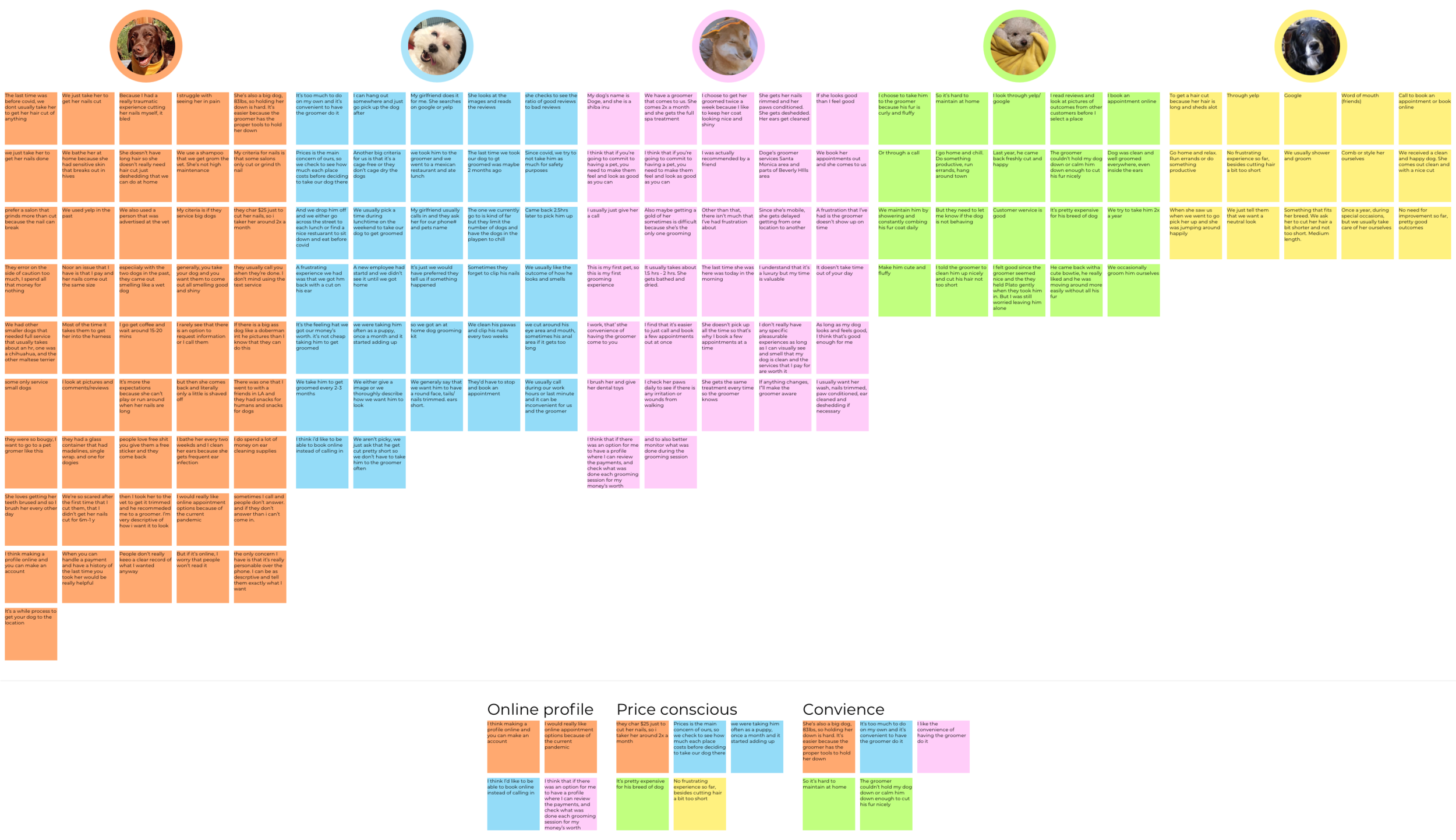
Empathy Map
To understand user’s needs, goals, frustrations, and motivations. I created an empathy map where I transcribed all sentences that users stated onto individual post-its. After I transcribed all statements, I organized and grouped the statements based on similarity to uncover user’s insights and needs.
Findings
Insights
• 3 of 5- Most users would like to be able to book online
• 4 of 5 - Most users are price conscious so they only take their pet a few times a year
• 5 of 5 - All users have been calling in to make their appointments
Needs
•Users need to have an online profile
• Users need to be able to see transparent pricing to work grooming into their budget
• Users need to be able to describe to their groomer what they’re expecting
User persona
After I synthesized my research, I created a realistic and fictional persona that best represented my findings. Meet Anthony, he is an adult male that is secured in finances. He has a full-time job where he will need to take his dog to get groomed and only minorly maintain it at home.
I created the user persona so that I can reference back to as I am designing, and to be able to use it to justify the direction of the design.
Define
Constructed the point of view of Anthony by making sense of the data that was gathered through research based on customer’s needs and insight
POV Statements & HMW Questions
I created the point of view statements from Anthony’s perspective to be able to define and understand the user’s perspective. I did this so that I am able to formulate the ‘How might we?’ questions to help brainstorm ideas to help foresee any solutions to frustrations.
Brainstorming HMW solutions
I brainstormed each HMW question twice at 2 minutes each to draw about as many solutions as possible. Focused on the number of solutions instead of perfection, I did this so that I can come up with as many creative solutions as possible. This is essential in the defined stage because this is where I can generate ideas.
Strategy
Business and User goals
The Venn diagram below helped re-access the project goals to visually compare business goals and user goals to outline how the site should look. I did this to see how the two goals can be aligned and prioritized.
Site Map
With the gathered information from the competitor’s analysis, project goals, road map; I created a Pacific Pet Grooming Site Map that shows the site’s interconnectivity. I created this so that I could understand and organize how the site would function.
Ideate
To achieve the best possible solution by brainstorming all possible solutions.
Feature Roadmap
I prioritized and categorized features for Pacific Pet Grooming by creating a feature that took into consideration: business, technical, and user goals. I categorized based on: must-have, nice to have, surprising/delightful, and can come later. These features are prioritized based on capability, cost, and time.
UI Requirements
After I explored and brainstormed potential task flow and user flows I created a page of UI requirements for Pacific Pet Grooming.
This dictated what needs to be designed for Pacific Pet Grooming and helped keep information organized.
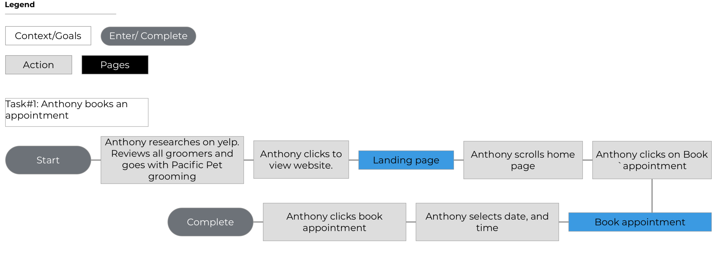
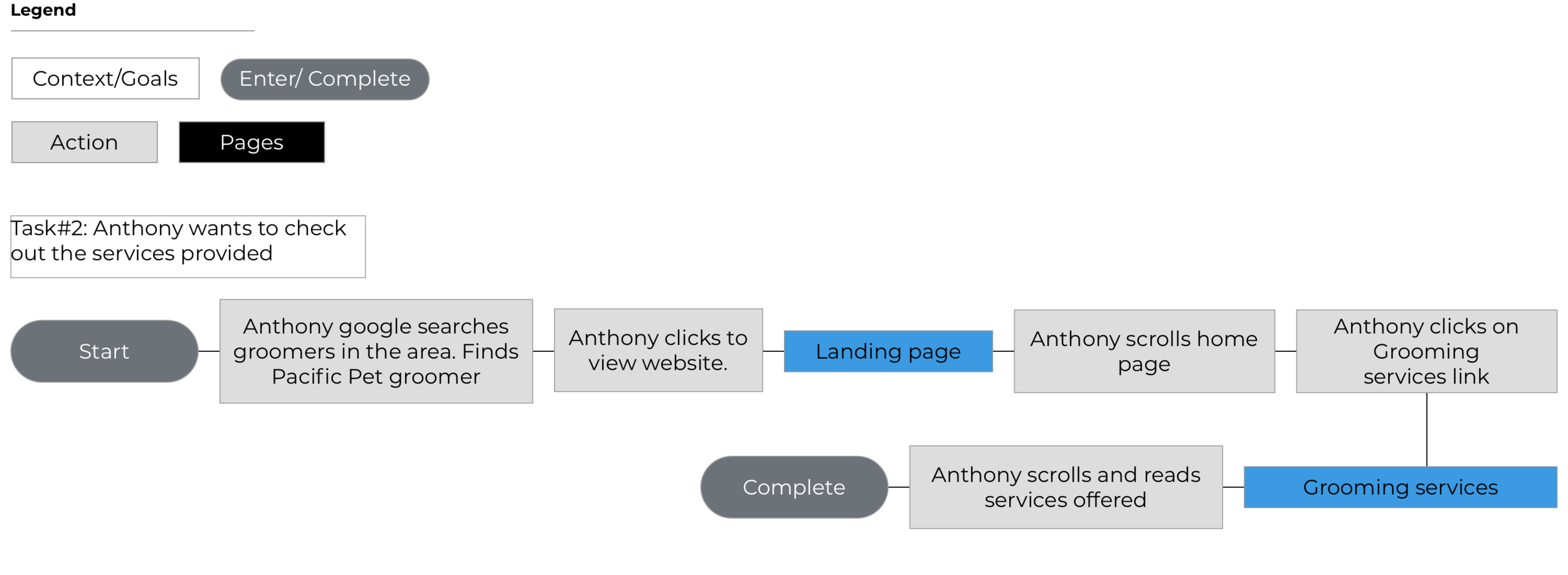
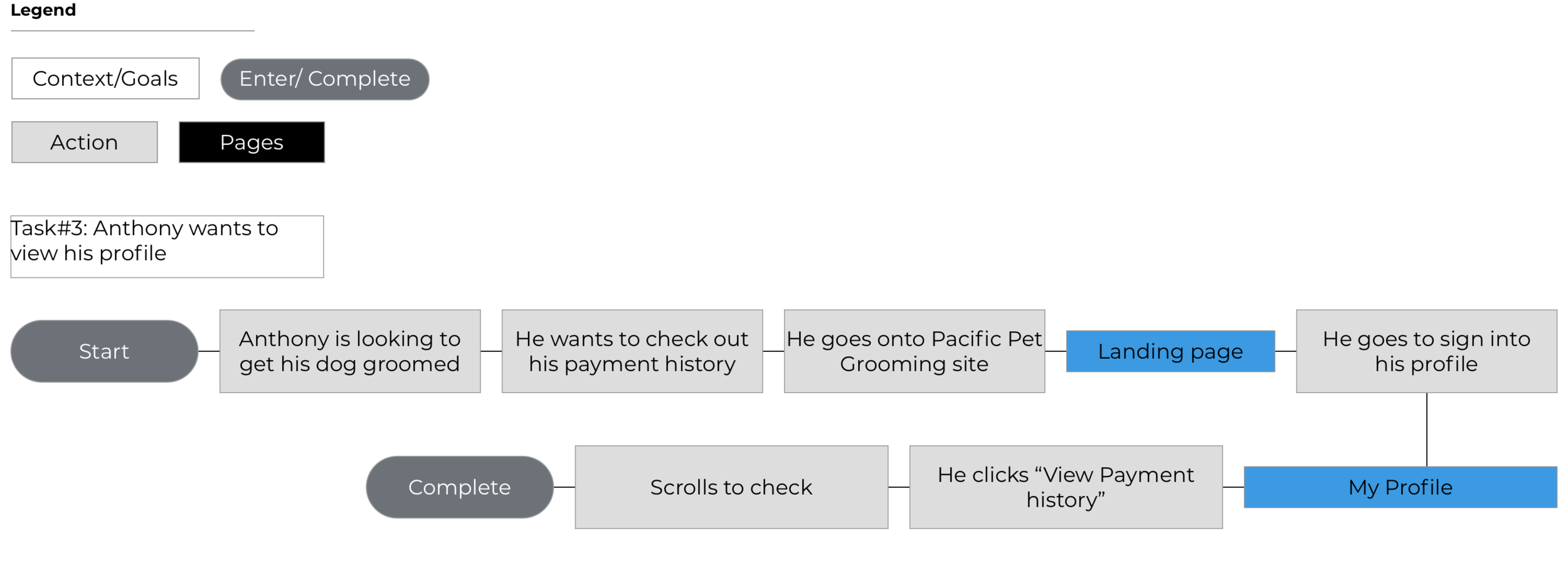
Task Flow
I defined potential tasks Users may take when interacting with Pacific Pet Grooming. I created a flow diagram to understand a path that a user could take to complete the task.
The three hypothetical and potential tasks are:
Task #1: Anthony books an appointment
Task #2: Anthony wants to check out the services provided
Task #3: Anthony wants to view his profile
View the Task flow in more detail below!
User Flow
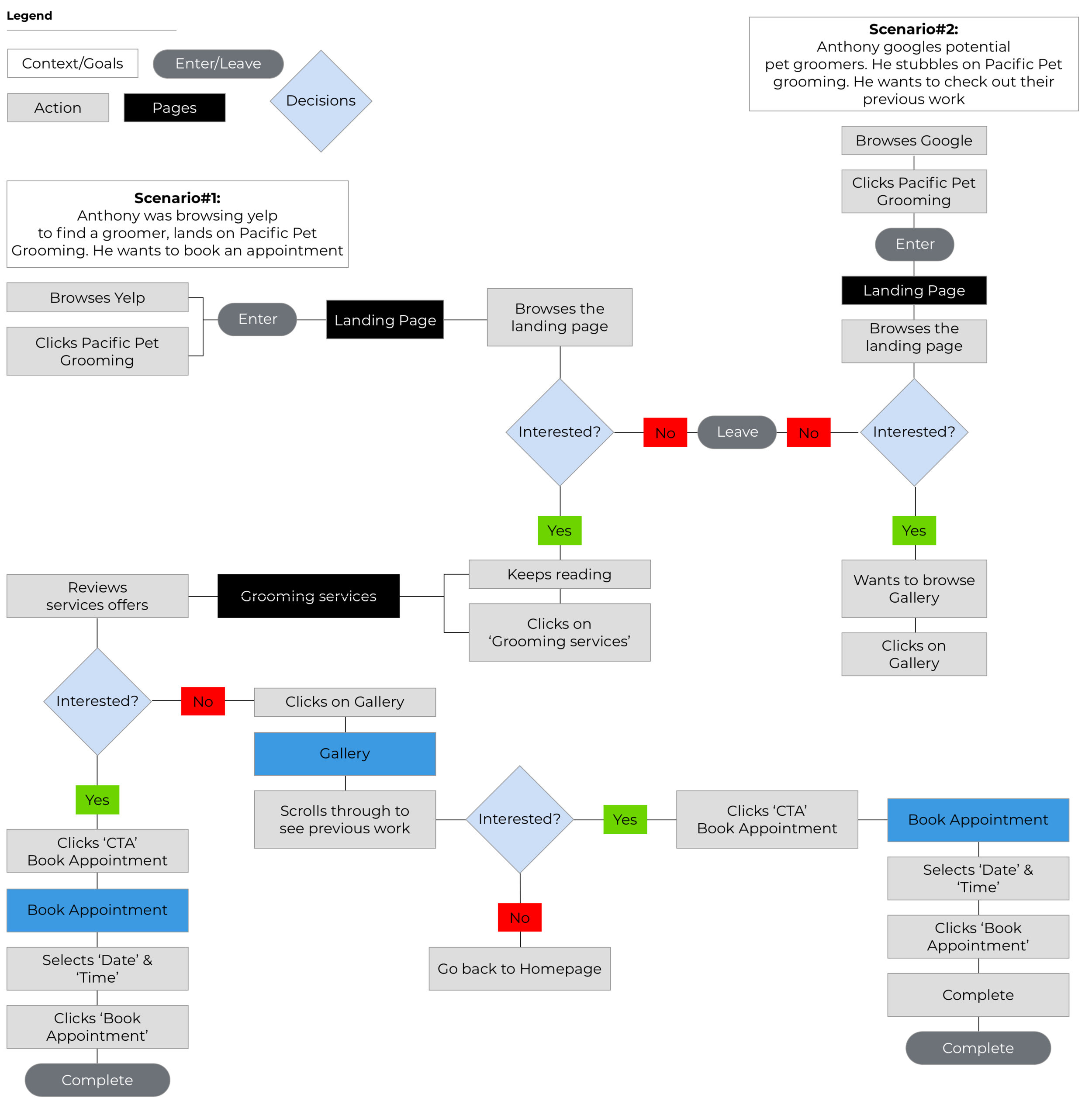
To better understand the User’s interaction with the site. I created a User Flow diagram to gain insight into potential navigational patterns of Users. I showed this by illustrating decision trees. I created two scenarios for Anthony in which I hypothesized his actions and decisions to get to certain pages on Pacific Pet Grooming’s site.
The two scenarios that I created for Anthony are:
Scenario #1: Anthony was growing yelp to find a groomer, lands on Pacific Pet Grooming, He wants to book an appointment
Scenario #2: Anthony googles potential pet groomers. He stubbles on Pacific Pet grooming. He wants to check out their previous work.
View the User flow in more detail below!
Wireframes
Sketches
After I created the UI requirements document, I started sketching into each screen/page for Pacific Pet Grooming. I did this so that I can generate as many ideas as possible to create the best solution for the User pulling from competitor sites, and personal needs, goals, frustrations, and motivations.
Mid-fidelity responsive wireframes
After I generated as many sketches that I can, I started digitizing Mid-Fi responsive wireframes landing page, services, book appointments, about us, and profile page to visually realize what Pacific Pet Grooming. As well as any possible problems that can occur on multiple devices: Desktop, Tablet, and Mobile. I conducted usability testing using this prototype.
Prototype
I then moved into creating a high fidelity representation of prototype to be able to test for ideas and solutions.
After I rendered the mid-fidelity wireframes, I created a prototype using Invision. This mid-fidelity prototype is a simplified version consisting of the landing page, services page, about us page, book appointment page, and profile page. I used this prototype to conduct a usability test and asked participants to complete the following tasks:
Task #1: Check out the services provided
Task #2: Book an appointment
Additional, if time permits:
Task#3: Check out his profile
Check out the link below to the prototype below!
Test
I used the prototype to conduct testing to gain insight into user feedback to help prioritize revisions to help implement any changes for bettering the site
Usability test
Usability test plan
Created a plan to help guide in the process of testing prototype with focus on the following:
• Test goals
• Test subjects
• Methodologies
• Participants/ Recruiting plan
• Test completion rate
• Error free rate
Read script in full detail here.
Summary of User Interview
# of participants: 6
Length of interviews: 10-15 minutes
5 females / 1 male
Ages: 20 - 40
Affinity map
Observed and recorded findings through transcribing testing in detail, documented slips, and time of completion. I created an affinity map based on my research findings, I noted down everything that was said by each participant during the usability test on to post-it notes. I created clusters out of any common frustrations or actions. I did this to synthesize information that I gathered from conducting the PPG prototype test to uncover any issues so that I can increase usability for the users.
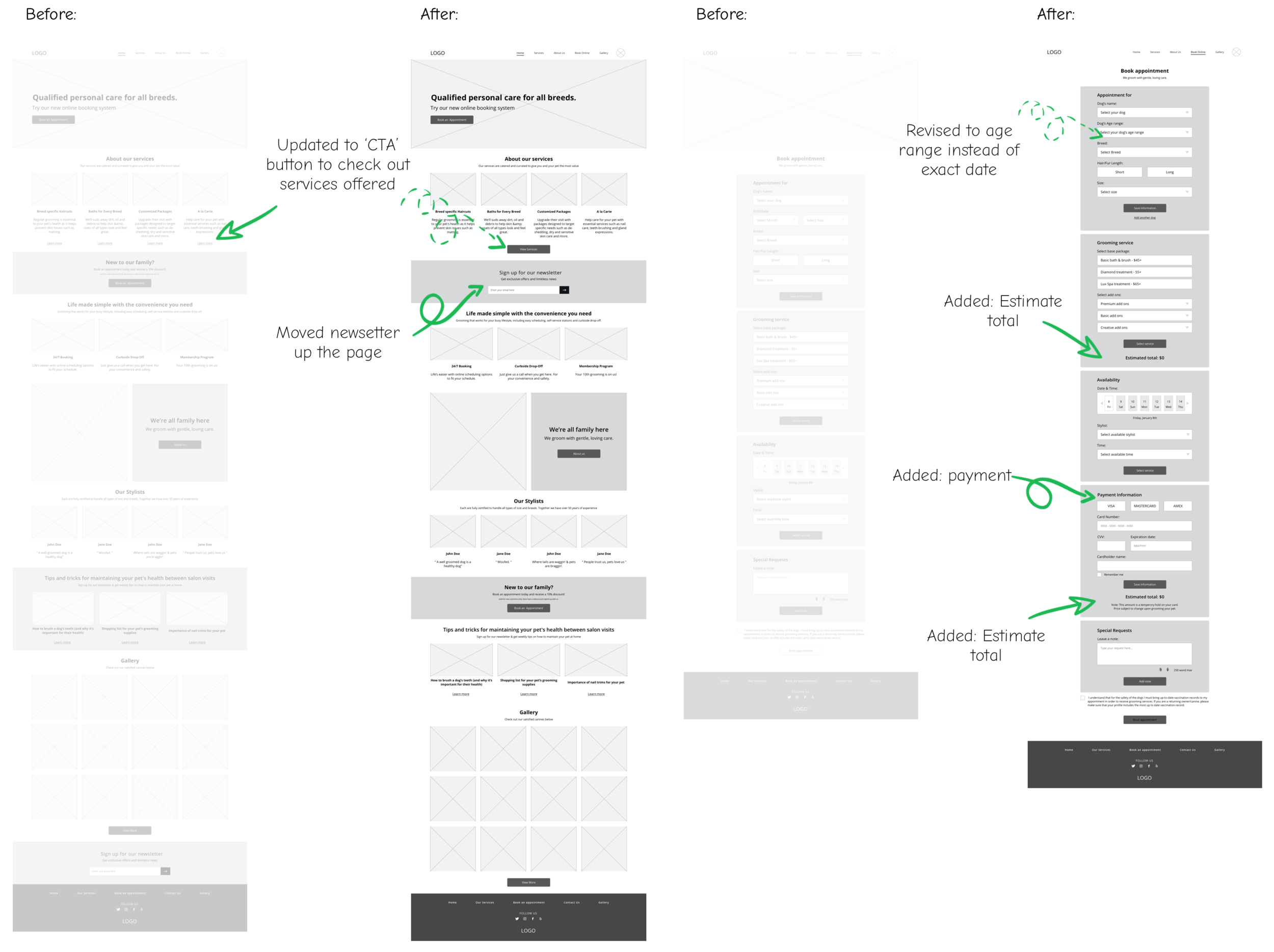
Mid-fidelity Priority revisions
After I synthesized the information and learned about the user’s frustrations while interacting with my prototype. I revised the prototype using my priority chart. I did this so that I can further test my revisions to better my understanding of usability for my users before adding in any colors, images that may distract users from full engagement with the information architecture.
Main revisions:
Added CTA to ‘Our Services’ on the Landing page
Moved newsletter to be higher in the information hierarchy
Indicated the user profile with ‘Hi “username'“!’
Added payment to ‘Book Appointment’ page
Changed CTA button color at the end of book appointment to be more noticeable
Branding
Before I sketched into the logo, I started thinking about the brand’s attributes:
Trustworthy
Fun
Inviting
Friendly
Modern
I then created a Pinterest board for Pacific Pet Grooming to gather inspiration for: Logo, Typography, Color
Check it out here!
Sketches
Focused on the brand’s attributes, I brainstormed how the Pacific Pet Grooming logo could be reworked to better fit the brand’s attributes. I started by hand sketching out my ideas. I reiterated and vectorized it into different scales. I went through a few iterations with opinions from my mentor’s guidance.
Style Tile
In unison with the logo creation, I created this Pacific Pet Grooming style tile to synthesize the research and inspiration for the logo, color, typography, and imagery. This acted as a guide when creating hi-fi responsive wireframes to maintain cohesiveness.
Responsive UI Design
I used the style tile and the mid-fi responsive wireframes as a reference as I designed the landing page and services page. I used the style tile to create the UI and review for the overall cohesiveness in the information hierarchy.
UI Kit
I then created the high-fidelity responsive wireframes. I created a compiled file that stores all UI elements. This UI kit is only a draft version, this will get reworked as the site gets maintained and updated. I created this file to be able to communicate with developers, stakeholders, project managers, and business owners.
High Fidelity Prototype
After I conducted my usability testing on the mid-fidelity wireframes, as well as creating the responsive UI in high fidelity. I created a high-fidelity prototype to further test for usability by adding color/graphics to each page. I did this so that I can further dive into any insights to better Pacific Pet grooming before launch.
Final thoughts + Next steps
Final thoughts
This was a rewarding project for me.
I was able to step out of my box and really challenge myself in the aesthetic side of the design. Coming from a fashion design background, I am drawn to the color black for everything because it’s most flattering on the body. However, with this project, in particular, I knew that it was going to be challenging in balancing color and information hierarchy. I kept the information relatively short and made sure the keep the images in the same tone. I also made sure to pick images that have the brand’s color/accent to make it really ‘pop.’
I also thoroughly enjoyed the interview and usability testing aspect of this project, as well as balancing the critiques of the business owner, peer, and mentor. I learned how to properly communicate my ideas using facts from my research to justify my decisions. I also used previous skills of negotiation to leverage some design aspects over others.
Not only that, I was able to showcase my adobe illustrator skills in logo design. I was able to convenience the owner to let me propose a new logo design that would be more scalable and functional. I have used illustrator almost every day for the past 10 years and it was nice to be able to bring that skill into this project.
Next steps
Using the revised prototype, I would re-test the priority revision recommendations. Finalize as much of the UI kit as possible (this would get updated as the product gets developed), and finalize any design specs using InVision Inspect to be able to handed off to developers. I will be available for any further questions.


